We have prepared a three-article series on test automation for everyone interested in the quality of digital projects. The first article helps you identify how to achieve your goals through test automation. The second article will provide an introduction to Flutter automation testing, catering to Flutter testers and developers. This is the third and final article in the series delves deeper into Flutter test automation, specifically tailored for Flutter developers.
Widget tests.
Widgets tests despite their name can help testing the whole user flow, not only separate widgets. For example, Burger King Suomi app has many widget tests to test that the most important parts of what the user does in the app work as expected: signing in, finding a restaurant, using coupons, customizing a meal, placing an order. Some tests check the whole flow end to end: from app launch to successfully placed order.
Since widgets tests can be run headlessly (without a device or emulator) it’s impossible to make network calls, use actual user accounts and real backend responses. In order to overcome this we’re using a lot of mock data.
Most of the mocks are happening at the very bottom of the app’s layered architecture. For example, HTTP client returns mock API responses in order to return a certain menu structure, coupon or error code. Mocking API calls makes the app work architecturally the same way it does when using actual API responses. These mocks don’t change the way app’s business logic works, there’s no special “test app behavior”.
The reason we’re using widgets tests to test user flows is that they’re easier to write and faster to run than Flutter’s integration tests. We run widget tests before every pull request can be merged to main.
Here’s an example of a simple widget test for ShoppingCardWidget’s functionality of adding cart items:
testWidgets(
  'ShoppingCartWidget can add items to the cart',
  (WidgetTester tester) async {
    // Build the widget
    await tester.pumpWidget(ShoppingCartWidget());
    await tester.pumpAndSettle();

    // Verify that the cart is initially empty
    expect(find.text('Cart is empty'), findsOneWidget);

    // Tap on the "Add Item" button
    await tester.tap(find.text('Add to cart'));
    await tester.pumpAndSettle();

    // Verify that the cart now contains the added item
    expect(find.text('Item added to cart'), findsOneWidget);
    expect(find.text('Cart: 1 item'), findsOneWidget);
  },
);
Golden tests.
Running tests headlessly is the same as running the app on a device but instead of an app or a window for drawing it uses a virtual canvas. This canvas is an array of pixels and can be saved as a picture.
Golden tests compare the current state of the canvas with the previously saved state. In practice it works as pixel by pixel comparison of screenshots. In a way it’s the same old “expect” but instead of checking an object it compares two images.
As with other test types, it’s important to test what actually matters. Golden tests easily fail if there’s a tiny UI change. It’s easy to update golden files but it’s harder to validate these changes. For example, if there’s a one-liner color change in the app’s theme it’s quite possible that a lot of PNGs would need to be regenerated and thoroughly checked by a human at the pull request review step. This could lead to issues when reviewer didn’t notice some unwanted changes.
Here’s an addition to the previous code example where golden test is used to check how widget looks before and after new card item is added:
// Build the widget
// ...

// Initial state: cart is empty
await screenMatchesGolden(tester, 'shopping_cart_widget_initial');

// Tap on the "Add Item" button
// ...

// One cart item state
await screenMatchesGolden(tester, 'shopping_cart_widget_one_item');
Testing is an important part of the app development process. Deciding what and how to test is crucial for ensuring the reliability and functionality of the app. Framework and community offer many options for testing. To learn more about testing Flutter apps explore official documentation and golden_toolkit package documentation.
Wrap up.
We hope you have enjoyed reading some of our thoughts on Flutter test automation and perhaps will take a few ideas that can promote active discussion before you jump in. Follow our Rebel App Studio X account if you haven’t already. We share timely topics and provide updates on Flutter related events we are arranging or participating in.
Contact Minna
Minna Karvonen
Head of Design & Quality Services, Senior Consultant
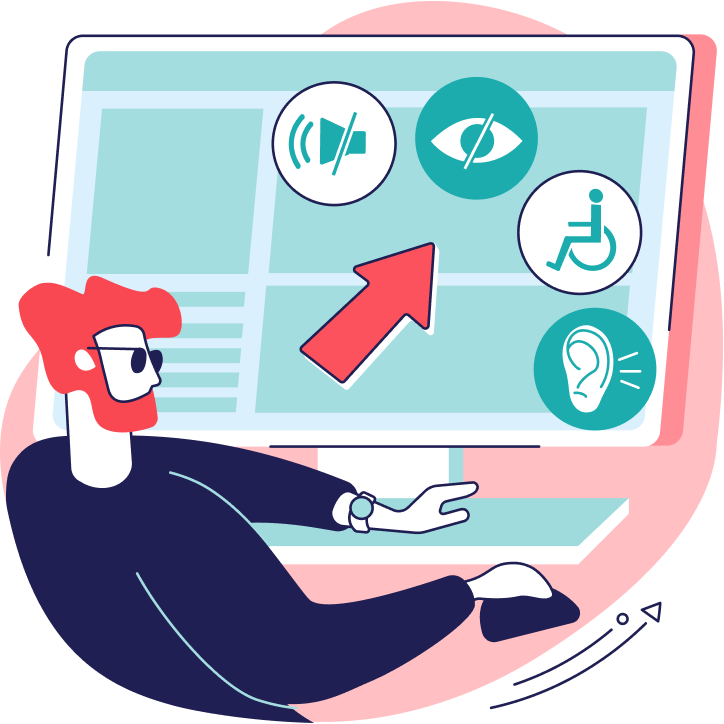
Accessibility issues impact all of us at different stages of our lives, whether they are permanent, temporary, or situational. Some individuals face lifelong challenges such as blindness or deafness, while others may experience temporary limitations due to injuries. Situational examples include being a new parent carrying a baby in one arm and trying to operate a phone with the other hand, struggling to see the screen after having dilated pupils from an eye appointment, or finding it more convenient to use speech input due to the environment or personal factors like accents. Considering that accessibility needs can affect anyone, it becomes crucial to prioritize accessibility in the design and development of apps and other digital solutions. This blog article aims to highlight five essential considerations when creating an accessible Flutter app. These insights were previously discussed in our online meetup held in March 2023
As this is a long read, you can jump also to the topics that interests you the most:
The first thing to consider when designing for accessibility is readability. Text size is a crucial factor here, and it’s essential to make sure that your app’s text is legible and adequately sized. Research has shown that up to 35% of iOS users do not use the standard text size, so it’s vital to make sure that your app can accommodate different font sizes.
To ensure that your app’s content is easy to read, you should separate the contents clearly from each other, use an adequate font size, legible font, and appropriate character spacing and line spacing.
Text Overflow
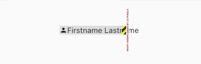
Text overflow is a common issue that can occur when working with Flutter. When dealing with Rows and Text, always use Expanded or Flexible to ensure that the text is wrapped nicely, even when the user changes the font size or when the backend returns longer text parameters. Otherwise, you’ll see black and yellow boxes near the border, indicating the text overflow issue.
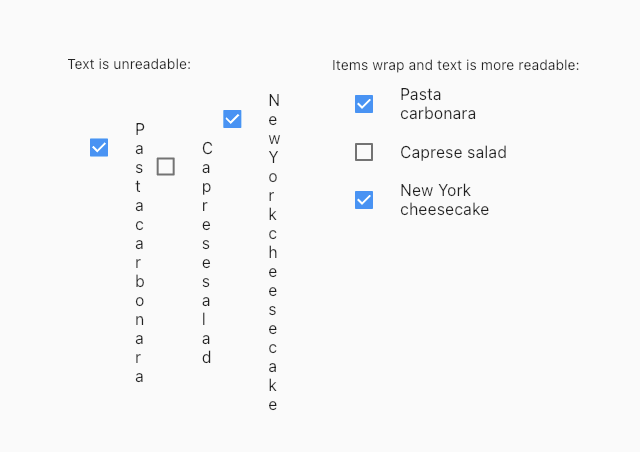
Wrap Instead of Row
Another issue with Row is that it may not work correctly when you have a Row of items that are already wrapped into Expanded widgets. In such cases, the text might become unreadable when you rotate the device, apply a new localization, or increase the text size. The solution is to use Wrap instead of Row to make it responsive and easier to read.
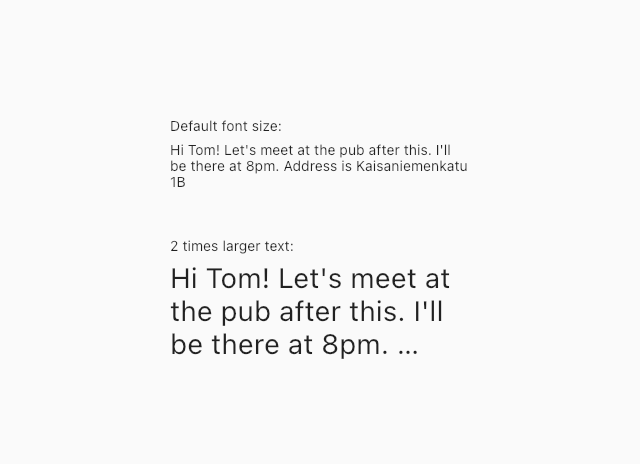
maxLines and text cutting off
maxLines is another parameter that can affect your app’s accessibility. It determines the maximum number of lines that a text widget can display. However, if the text is too long and exceeds the maxLines parameter, the text may cut off, making it challenging to read.
To avoid this issue, use maxLines only when it makes sense to do so, such as when displaying a text preview. Otherwise, avoid using maxLines when showing actual content, as it may not be wise to set maxLines if it cuts off important information.
Contrast and Color Blindness
Color contrast is an essential aspect of accessibility. It is crucial to make sure that the text and background colors have enough contrast to ensure that users can read the content easily. Some users may have color blindness, making it difficult for them to distinguish between different colors.
To ensure that your app is accessible to users with color blindness, use colors that have sufficient contrast and are distinguishable. Additionally, consider using color schemes that work well for users with color blindness. Developers can use textContrastGuideline that Flutter provides to make sure text inputs have high enough contrast:
testWidgets('HomePage meets contrast guideline', (tester) async {
    // Enable semantics in this test
    final handle = tester.ensureSemantics();

    // Pump the widget
    await tester.pumpWidget(const MaterialApp(home: HomePage()));

    // Check that it meets the guideline
    await expectLater(tester, meetsGuideline(textContrastGuideline));
    handle.dispose();
});
02 Color
Color is an vital element in design, and getting it right is crucial, especially from a design point of view. Adequate contrast between text, informative elements, and the background is necessary for accessibility. However, color plays a significant role in all kinds of design. Color is indispensable for people with visual impairments or color blindness or those with low vision. Sometimes environmental factors, such as low brightness or reflections, can affect visual capacity.
Different types of color impairments exist, depending on which color the user cannot see. Some impairments are more common than others. Fortunately, Figma has a plugin that can validate different types of vision deficiencies with just a few clicks. It is vital to provide enough visual cues for CTAs and error messages. It is also helpful to use both an icon and a text, not just one or the other.
The focus states should also be emphasized, and using thick lines or an attention color can help. There has always been a debate about which is better: light mode or dark mode. Both have their benefits and downsides. It is possible to use both, and dark mode is particularly helpful for people with visual impairments. In fact, over 30% of the Netherlands uses dark mode, which is more than expected.
Inverted colors and high contrast mode are other modes that should be addressed. It is essential to make sure that contrast guidelines are being followed. Flutter has a test package that developers can use in their widget tests to ensure that guidelines are met. The package goes through the semantic tree, looking for nodes that correspond to a text or editable text widget, and calculates the contrast ratio from the most frequently occurring color according to a WCAG standard.
Overall, color is a crucial element in design, and it is important to ensure that it is used correctly. It is important to consider the needs of users with visual impairments and to provide enough visual cues for all users. By following guidelines and using tools such as Figma and Flutter, designers and developers can create accessible apps that meet the needs of all users.
03 Input
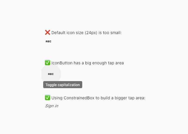
Input is a crucial aspect of any mobile application. It refers to how users interact with the app through various touch inputs, such as tapping and swiping. In this section, we will focus on the importance of tap areas in mobile app development, particularly in Flutter.
Tap areas are the clickable or touchable regions of the user interface, such as buttons or links. They are crucial for providing a smooth and seamless user experience. If the tappable area is too small, users may get frustrated and encounter errors while using the app. This is especially true for users with limited motor skills, for whom having big enough tap areas is critical.
Unfortunately, developers often overlook the importance of tap areas, either because they are not aware of the issue, or they think it is not a significant concern. As a result, tiny tap areas are a common problem in many mobile apps. This is often due to lack of consideration for accessibility or testing on real devices.
Flutter provides several tools to help developers create appropriate tap areas. For example, the Material Design guidelines recommend a minimum tap area size of 48 by 48 pixels. Flutter’s IconButton widget is an easy way to provide a decent tap area size for icons and also provides feedback, such as a ripple effect. Additionally, developers can use ConstrainedBox and SizedBox to create custom tap areas.
To ensure that clickable widgets meet the minimum size requirements, Flutter provides the androidTapTargetGuideline and iOSTapTargetGuideline, which check for tap areas of at least 48 by 48 and 44 by 44 pixels, respectively. Developers can also create their own guidelines to make sure their clickable widgets are at least a particular size. The accessibility_tools package can also be used to detect when a tap area is too small during UI building.
04 Animations
Animations can make a big impact on the user experience of an app, but some users may choose to disable or reduce the animations on their device. As developers, we need to be mindful of this and design our apps in a way that still makes them usable without relying solely on animations to convey important information.
One way to do this is to use other visual cues such as color, typography, and layout to draw attention to important elements in the app. Additionally, it’s important to not use animations just for the sake of drawing attention, but to have a clear purpose behind them that enhances the user experience. From a technical standpoint, we can use the MediaQuery class in Flutter to check whether animations are currently enabled or disabled on the device, and adjust our app behavior accordingly:
final areAnimationsOn = MediaQuery.of(context).disableAnimations;
Developers can use a debug flag called debugSemanticsDisableAnimations to test app’s behavior when animations are disabled:
debugSemanticsDisableAnimations = true;
Overall, animations can be a powerful tool in designing engaging and intuitive user interfaces, but it’s important to consider the potential impact of animation settings on user experience and design our apps in a way that remains accessible and usable even with reduced animations.
05 Screen readers
Screen readers are those devices that help people with visual impairments to access all kinds of digital content. Designing for screen readers requires a lot of effort to make the application usable via keyboard. It is vital to ensure that the focus states are always visible and that the focus state visually follows the content order. Additionally, announcing errors clearly and offering some options, such as cancel, is essential. It is also crucial to make sure that things are in order and that users can navigate through using other forms other than just touching things.
A handy plugin for Figma called Focus Orderer allows designers to annotate designs with different focuses and tab orders. However, when making an app accessible to screen readers, the main thing to consider is ensuring that all elements have semantic information. A semantic label is some kind of descriptive text associated with an interactive widget in the Flutter app. This text provides information or context to the screen reader, which is used by a screen reader user to understand what the currently focused element is doing.
Sometimes you do not need to add a semantic label, as some widgets create semantic annotations under the hood, like text buttons, texts, and form fields:
// Semantic label in this case is "Button - Sign in"
TextButton(
    onPressed: () {},
    child: Text('Sign in'),
)
However, when you do need to add a semantic label, you can use the Semantics widget. For example, if you have an icon and decide to use a GestureDetector to make it clickable, you should think about adding a semantic label. There are several ways to do that, such as using the semanticLabel argument or the Semantics widget:
Flutter automatically inserts lots of different semantics labels into your widget tree when you use built-in controls and widgets. However, when you are doing things like custom radio buttons and checkboxes, it is important to use properties on those as well as these labels. Providing people with clues that they are tappable is key.
Developers can uselabeledTapTargetGuideline to make sure all tappable areas have semantic labels. Another option is to use accessibility_tools package in case you want to get such warnings while developing your UI.
Lastly, when building a form, you might think about using TextField’s decoration and providing a hint instead of using a Column with a title and a text field:
// This doesn’t give any context about text field to screen readers
Column(
    children: [
        Text('Email'),
        TextField(),
    ],
)

// This provides context what is expected by this text field
TextField(
    decoration: InputDecoration(
        hintText: 'Email',
    ),
)
This way, the text field is associated with the hint text, making it clearer for screen reader users. It is important to remember that making an app accessible to screen readers requires a lot of effort, but it is a critical step towards creating a more inclusive application.
To sum it up
In conclusion, developing an accessible app is about ensuring that everyone, regardless of their abilities or disabilities, can use and enjoy your app. By keeping readability, color, input, animations and screen readers in mind when designing and developing your app, you can create an app that is accessible to everyone.
Want to dig deeper into the subject? Then check out our meetup recording on Youtube: