Back to the blog

2024 highlights: New platforms, stronger teams, and a thriving Flutter community

As 2024 draws to a close, we at Rebel App Studio want to take a moment to reflect. It’s been another great year for Rebels, as we’ve continued to create stunning Flutter apps and make meaningful contributions to the Flutter community – which we love dearly!

As 2024 draws to a close, we at Rebel App Studio want to take a moment to reflect. It’s been another great year for Rebels, as we’ve continued to create stunning Flutter apps and make meaningful contributions to the Flutter community – which we love dearly!

A year of growth

2024 was a year of success for both Rebels and Flutter. With an increasing number of big production apps built using Flutter—including several developed by our team—we’ve seen the framework thrive. Rebel App Studioby Codemate now boasts a team of 100 skilled professionals and strong operations in Europe and the US. As part of a larger company group with over 1,500 consultants, we have the expertise and resources to tackle any technical challenge or business goal.

Rebel App Studio by Codemate is, above all, about our awesome employees, and our top priority is to give them opportunities to grow and advance in their careers. One of the best ways to grow is by collaborating with a team of experts who inspire and challenge you. This commitment is reflected in some key achievements from 2024:

🚀 Our eNPS remains consistently excellent, scoring above 50.
👩‍💻 The average coding experience across our team is now 15+ years.
🏆 The median employee tenure has reached an impressive 6.8 years.

Unlocking new platforms

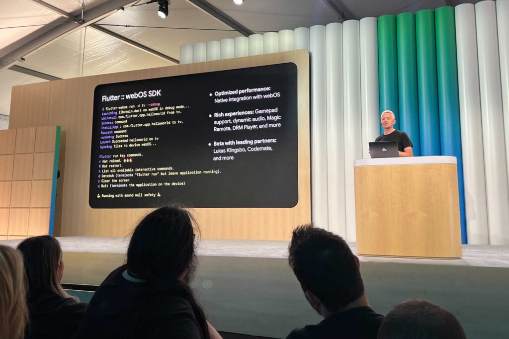
This year, we are continuing to unlock Flutter’s full potential, exploring new possibilities with projects targeting emerging screens. As early adopters, we were among the first in the world to create a production Flutter app – Hookle’s iOS and Android apps launched in 2017 while Flutter was still in beta. In 2021, we broke new ground again with the Moi Web app, one of the first Flutter for Web applications. Now, in 2024, we are thrilled to announce that we are developing multiple Flutter apps for TV platforms, including Android TV, Tizen and webOS. 

Building solutions that make a difference

This year, our team was privileged to work on impactful projects that solve real-world problems.

Here are some highlights:

📰 Media Group Keskisuomalainen: Driving digital transformation for Finland’s largest media group
📱 Moi Mobile: Elevating a bold mobile operator contender to the next level
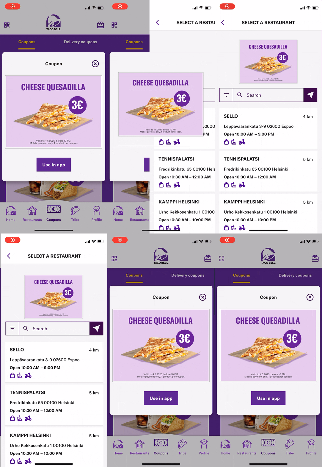
🌮 Taco Bell Finland: Creating a user-centric app to boost customer engagement

These collaborations showcase our ability to create innovative, tailored solutions that meet the unique needs of our clients and their users.

Sharing knowledge, building community

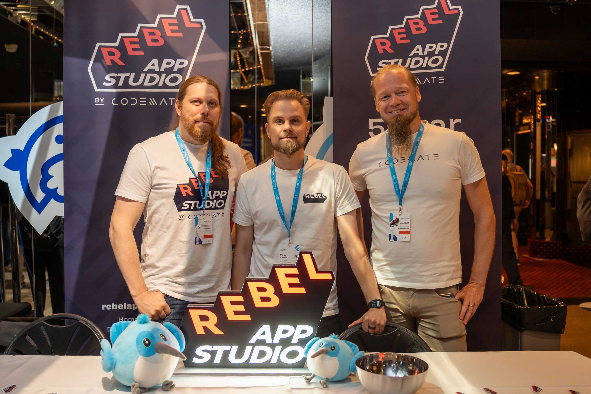
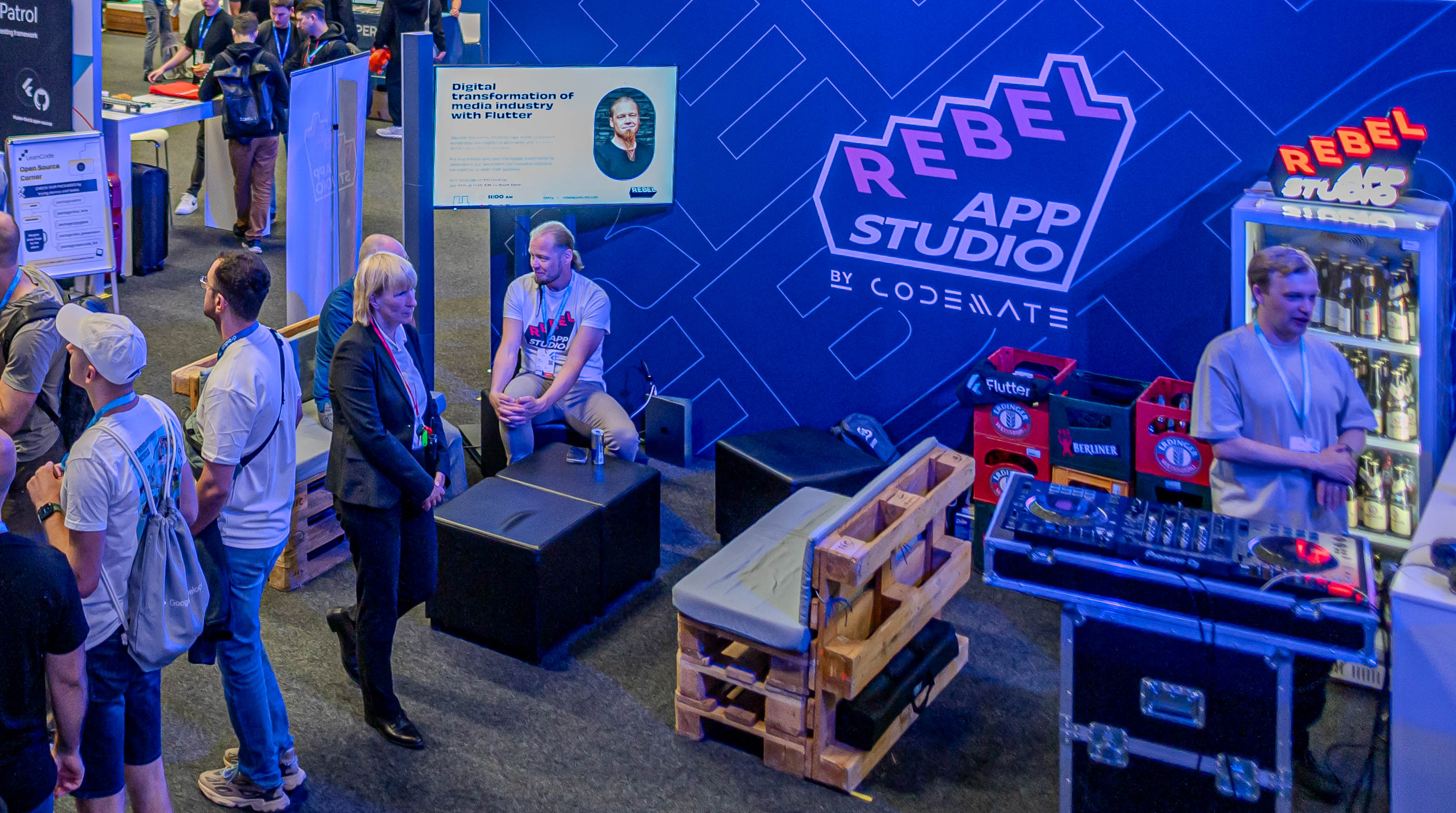
This year, our Rebels took centre stage on the global Flutter scene. In July, we joined Fluttercon Europe, sharing our expertise and connecting with the vibrant Flutter community. Not stopping there, we had the honour of participating in the first-ever Fluttercon USA in September.

For the second consecutive year, we partnered with Flutter & Friends to host engaging livestreams, further cementing our place in the Flutter ecosystem. These collaborations allowed us to share insights, learn from others, and contribute to the ever-growing Flutter ecosystem.

Building for everyone: Accessibility and localisation highlights of 2024

Empowering the Flutter community with practical, developer-friendly solutions is at the core of what we do. In fall 2024, we launched Rebellion, a tool designed to simplify localisation in Flutter apps. With Rebellion, developers can easily check localisation files for errors, making it easier to create apps that resonate with users worldwide.

Accessibility also saw major strides. We updated our Accessibility Tools, by adding a set of tools for manual accessibility testing. Now font size, dark/light theme, text direction, bold text flag, and visual density can be changed directly from the app to ensure that your app handles changes correctly. This aligns with our focus on the upcoming European Accessibility Act, which will bring accessibility requirements to new heights in 2025.

Psst 🤫 Our senior developer Alexander shared insights on accessibility tools during Fluttercon Europe—check out his talk here.

Looking forward

To date, we have released over 80 Flutter applications, solidifying our expertise and commitment to delivering exceptional cross-platform solutions.

As we prepare for 2025, we’re excited to continue innovating, collaborating, and growing within the Flutter community. Thank you to our clients, partners, and team members for making 2024 unforgettable. Here’s to an even brighter future!

Would you benefit from having extremely senior Flutter experts on your team?

Contact Miika to learn how we can help you proceed with your digital projects:

Miika Toljamo
Business
+358 40 734 9399
miika.toljamo@rebelappstudio.com or connect on LinkedIn!

Read more

All blogs
Back to the blog

Flutter vs FlutterFlow: which is right for your project?

Are you considering whether FlutterFlow can benefit your development team or project? FlutterFlow is a low-code platform that allows users to build mobile applications using a visual drag-and-drop interface, making it an appealing option for teams with limited coding experience. We tested this by developing the same app twice – once using Flutter and once using FlutterFlow. Our goal was to see how each method impacts development from various perspectives, including resource usage and the overall developer experience.

Are you considering whether FlutterFlow can benefit your development team or project? FlutterFlow is a low-code platform that allows users to build mobile applications using a visual drag-and-drop interface, making it an appealing option for teams with limited coding experience. We tested this by developing the same app twice – once using Flutter and once using FlutterFlow. Our goal was to see how each method impacts development from various perspectives, including resource usage and the overall developer experience.

In this blog, we summarise the insights from software developer, Joakim Liukkonen, who coded a simple app using both tools.

Key differences in resource usage

Why consider FlutterFlow? Here are some factors that standout:

Time savings

FlutterFlow’s drag-and-drop interface makes prototyping faster, saving valuable time for other essential project phases, such as gathering customer requirements and design.

💵 Cost efficiency

With faster production times, you can save money on development costs, especially during the early stages. FlutterFlow is also an excellent tool for less experienced developers or interns to contribute to simpler tasks, lowering overall resource costs.

⚖️ Lower expertise requirements

FlutterFlow is beginner-friendly and requires less expertise to get started, making it an ideal choice for teams with limited experience in mobile development.

While these factors make FlutterFlow appealing, Flutter has its advantages. Though it may take longer to develop prototypes, Flutter produces robust, cross-platform applications with code quality that stands out, especially when handled by experienced developers. If your project demands higher complexity and long-term maintenance, Flutter’s flexibility and powerful features are more likely to meet your needs.

Choosing between Flutter and FlutterFlow

When deciding between Flutter and FlutterFlow, consider the nature of your project. If you’re focusing on quick prototypes or proofs of concept, FlutterFlow’s speed and ease of use are highly advantageous. However, for larger, more intricate projects that require expert-level customisation and long-term code maintenance, Flutter is the better choice.

In some cases, you may find a complementary approach works best – using both tools where they excel. For instance, you can create a prototype in FlutterFlow but switch to Flutter for full-scale development, keeping in mind the limitations of back-and-forth transitions between the two.

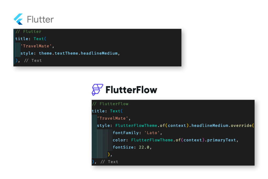
Flutter vs. FlutterFlow

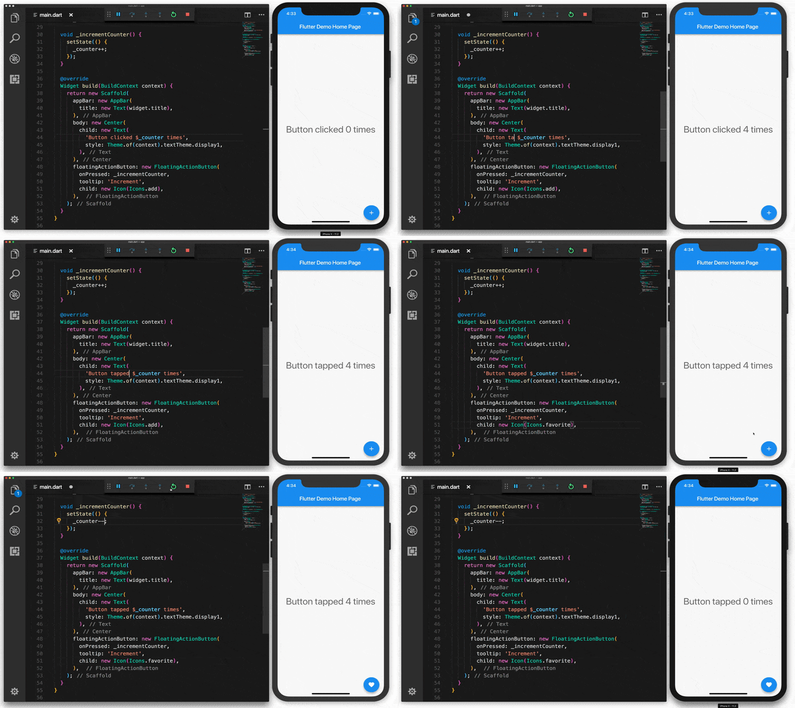
A simple example elaborating the difference between Flutter and FlutterFlow code.

Developer experience: Flutter vs. FlutterFlow

The development experience with Flutter and FlutterFlow differs significantly based on a developer’s expertise level.

Flutter allows senior developers to take full control of the code structure, optimising it for maintainability and performance. Experienced developers prefer this freedom, as it enables them to produce clean, efficient code tailored to the project’s specific needs.

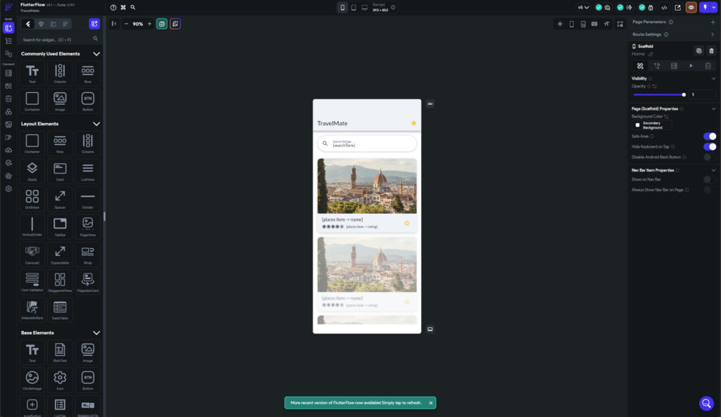
FlutterFlow drag and drop editor.

On the other hand, FlutterFlow’s drag-and-drop interface requires minimal coding skills, making it ideal for less experienced developers. However, as projects grow more complex, FlutterFlow’s auto-generated code can become difficult to manage, especially compared to the well-structured code that can be written with Flutter.

During our experiment, Liukkonen noted that FlutterFlow lacks the flexibility to organise widgets, variables, or files in a developer-friendly manner. In contrast, Flutter gives developers complete control over how they structure the app, allowing for greater scalability and easier code management.

Final takeaways: Which tool should you use?

Here are three key takeaways from our experiment:

🤙🏽 FlutterFlow excels in prototyping and quick PoCs

Its low barrier to entry allows for rapid prototyping, enabling more team members to contribute to the development process, even with minimal coding experience.

👥 Flutter is the go-to for complex projects requiring expert-level control

Projects that require a high degree of customization and long-term maintenance benefit from the flexibility and structure Flutter offers, making it the preferred tool for senior developers.

💙 Resource savings intrigue many companies

For short-term projects or those needing quick proof-of-concept development, FlutterFlow’s simplicity and speed make it an attractive option. It also enables non-developers to contribute to UI changes, speeding up updates and involving more team members in the process.

Bonus Tip:

FlutterFlow can even be a fun, easy way to introduce coding concepts to beginners – including primary school students! 🖥️

Read more

All blogs
Back to the blog

Flutter Test Automation with widget and golden tests

We have prepared a three-article series on test automation for everyone interested in the quality of digital projects. The first article helps you identify how to achieve your goals through test automation. The second article will provide an introduction to Flutter automation testing, catering to Flutter testers and developers. The third and final article in the series delves deeper into Flutter test automation, specifically tailored for Flutter developers.

We have prepared a three-article series on test automation for everyone interested in the quality of digital projects. The first article helps you identify how to achieve your goals through test automation. The second article will provide an introduction to Flutter automation testing, catering to Flutter testers and developers. The third and final article in the series delves deeper into Flutter test automation, specifically tailored for Flutter developers.

Widget tests

Widgets tests despite their name can help testing the whole user flow, not only separate widgets. For example, Burger King Suomi app has many widget tests to test that the most important parts of what the user does in the app work as expected: signing in, finding a restaurant, using coupons, customizing a meal, placing an order. Some tests check the whole flow end to end: from app launch to successfully placed order.

Since widgets tests can be run headlessly (without a device or emulator) it’s impossible to make network calls, use actual user accounts and real backend responses. In order to overcome this we’re using a lot of mock data.

Most of the mocks are happening at the very bottom of the app’s layered architecture. For example, HTTP client returns mock API responses in order to return a certain menu structure, coupon or error code. Mocking API calls makes the app work architecturally the same way it does when using actual API responses. These mocks don’t change the way app’s business logic works, there’s no special “test app behavior”.

The reason we’re using widgets tests to test user flows is that they’re easier to write and faster to run than Flutter’s integration tests. We run widget tests before every pull request can be merged to main.

Here’s an example of a simple widget test for ShoppingCardWidget’s functionality of adding cart items:

testWidgets(
  'ShoppingCartWidget can add items to the cart',
  (WidgetTester tester) async {
    // Build the widget
    await tester.pumpWidget(ShoppingCartWidget());
    await tester.pumpAndSettle();

    // Verify that the cart is initially empty
    expect(find.text('Cart is empty'), findsOneWidget);

    // Tap on the "Add Item" button
    await tester.tap(find.text('Add to cart'));
    await tester.pumpAndSettle();

    // Verify that the cart now contains the added item
    expect(find.text('Item added to cart'), findsOneWidget);
    expect(find.text('Cart: 1 item'), findsOneWidget);
  },
);

Golden tests

Running tests headlessly is the same as running the app on a device but instead of an app or a window for drawing it uses a virtual canvas. This canvas is an array of pixels and can be saved as a picture.

Golden tests compare the current state of the canvas with the previously saved state. In practice it works as pixel by pixel comparison of screenshots. In a way it’s the same old “expect” but instead of checking an object it compares two images.

As with other test types, it’s important to test what actually matters. Golden tests easily fail if there’s a tiny UI change. It’s easy to update golden files but it’s harder to validate these changes. For example, if there’s a one-liner color change in the app’s theme it’s quite possible that a lot of PNGs would need to be regenerated and thoroughly checked by a human at the pull request review step. This could lead to issues when reviewer didn’t notice some unwanted changes.

Here’s an addition to the previous code example where golden test is used to check how widget looks before and after new card item is added:

// Build the widget
// ...

// Initial state: cart is empty
await screenMatchesGolden(tester, 'shopping_cart_widget_initial');

// Tap on the "Add Item" button
// ...

// One cart item state
await screenMatchesGolden(tester, 'shopping_cart_widget_one_item');

Testing is an important part of the app development process. Deciding what and how to test is crucial for ensuring the reliability and functionality of the app. Framework and community offer many options for testing. To learn more about testing Flutter apps explore official documentation and golden_toolkit package documentation.

Wrap up

We hope you have enjoyed reading some of our thoughts on Flutter test automation and perhaps will take a few ideas that can promote active discussion before you jump in. Follow our Rebel App Studio X account if you haven’t already. We share timely topics and provide updates on Flutter related events we are arranging or participating in.

Contact Minna

Read more

All blogs
Back to the blog

Get familiar with test automation for Flutter apps

This is the second article of our three-article series on test automation for everyone interested in the quality of digital projects. The first article helps you identify how to achieve your goals through test automation. This second article provides an introduction to Flutter test automation, catering Flutter testers and developers. The third and final article in the series delves deeper into Flutter test automation, specifically tailored for Flutter developers.

This is the second article of our three-article series on test automation for everyone interested in the quality of digital projects. The first article helps you identify how to achieve your goals through test automation. This second article provides an introduction to Flutter test automation, catering Flutter testers and developers. The third and final article in the series delves deeper into Flutter test automation, specifically tailored for Flutter developers.

Flutter is our key technology used in RebelApps Studio; our flagship Flutter team that is part of Codemate. We are actively involved in core flutter expansion and development with Google.

Here we look at some of the tools available, the different layers and goals of each and share some of our thinking. Hopefully these are valuable to others. Especially for the developers and testers who are embarking on their first steps with the Flutter framework. It also a bit of a kudos shout out to the Flutter community in general, a key element for the continued ongoing success of Flutter as an often preferred framework.

Community Factor

One of the reasons the Flutter framework is thriving is the community of awesome people utilising it and contributing to improve it.

Community provides fantastic learning opportunities often from teams or individuals who are facing similar situations and challenges. So when we wanted to extend our use of test automation tools it was initially the community we looked to.

At some recent community meetups as Rebel App Studio we encountered LeanCode, they have been working on Patrol which extends the abilities of the inbuilt automation tools. LeanCode open sourced Patrol to community. We have it in active use so we will also touch on this in the article. 

Our test guild members have been contacted from the broader testing community looking to get started on Flutter automation. We’ve included a section “Tester Insight” that the community may also find useful. 

Kudos to the community.

Fluttercon, Berlin 2023 – Our team is thrilled to meet other Flutter enthusiasts in events.

Unit testing – Inbuilt Flutter tools

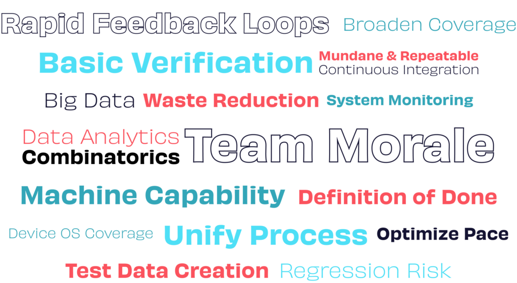
At unit level the goals are fairly common across most projects: develop quality software at optimal pace, rapid almost immediate feedback loop, verification that single functions or classes work in isolation.

Whilst not limited to unit tests there is also value in mocking any dependencies. This keeps the focus on the specific class you are testing and keeps the run speed optimal.

The Flutter documentation on both unit and widget test level is fairly good.

Widget testing

At widget level this shares the same optimal pace and rapid feedback loop goals but also adds in some basic verification that each widget looks and behaves as expected alongside some regression risk coverage goals.

The widgets can be run in isolation so it is not a requirement to build the entire app and you can run these tests without emulators or devices. You can gain insight at UI level whilst maintaining very rapid test runs.

Golden tests are another option here comparing the UI visually to catch regressions. Note that there is an indication that these can take longer to run so consider a balance between speed and value.

One value of adding Patrol finders is its optimised finder feature. It helps to create less and cleaner coder which in turn leads to lower development and maintenance costs. A significant value in our view. 

We were very early adopters of these tools at the above levels and we created these tests as we built the product. It will vary from project to project but generally we tend to have more coverage at the unit and widget levels than the end to end user flow layer.

Continuous Integration

In order to gain the full value of these tests, particularly the rapid feedback aspect, it makes sense for these to be run on every change as part of your CI implementation.

User end to end layer or Integration layer in Flutter terms

In the paired article we raised a couple of challenges at this layer and these factored into our general choice of value goals and the model that impacts the choice tools. We do evaluate and choose models and tools on a case by case basis.

The choice of in-built integration test tools is aligned with some of our values of close team collaboration. Our professional testers and developers often pair together and it allows the test automation code to remain fairly close to the product code base. Therefore we gain higher levels of efficiency.

The following is often a reasonable starting goal for this layer: provide a consistent health test level coverage of user core end to end flows. This offers value in terms of basic feature verification, some regression risk coverage, timely feedback loops, alongside a waste reduction readiness check for deeper investigation into those unknowns our testers love to explore.

Flutter inbuilt integration test layer

The Integration testing layer did meet our very basic needs. It was suitable for the creation of the straight forward health tests of key user flows within the apps. Like in many other frameworks we needed to add a lot of code to identify the widgets and elements we wanted to interact with. We do however regard it currently as still limited from a few aspects such as interaction with webviews outside the app or native device settings that could restrict any expansion beyond these basics.

Patrol – Open source UI testing framework

Patrol has hot restarts which provides significant time saving when developing your tests.

The next valuable area to us was the Native Automation features that Patrol introduced.  It’s a key feature that allows your tests to interact with the native side of things including notifications, webviews, permissions and device settings. By doing so you can broaden the coverage in your tests. Generally we found that it extends the Integration test tool and was fairly straightforward to start using it. It is ongoing development and we did run into a few challenges but overall the value seems good so far. At the time of writing a new version is recently out and there are some key improvements that we are following with interest and look forward to experimenting with. 

CI: End to end tests are slower to run than the other layers. You need to choose when to run these as part of your CI process. This is one of the reasons we often opt for light coverage at this layer. Patrol has sharding features that can help with speeding up your test runs but you may decide to schedule some of the tests to avoid slowing down the development.

Testers insight

This model encourages close collaboration and is a close to product code approach, it’s also a mobile application solution so it’s not as straightforward as pointing to web url and be scripting in an hour or so.

You will be using developer tools, building locally, reading product code, be comfortable doing low risk changes to product code like adding keys to widgets and also doing some actual code within your automation scripts. The level of your coding skills needed will vary but we recommend at least basic skills. Pair with a mobile developer at least initially if possible. In addition to the team collaboration and efficiency levels your understanding and communication levels with developers will also improve.

Automation is great, but when it comes to finding deeper, often more impactful issues and edge cases, hands-on risk based testing is very much needed. The aim should be to maintain a bigger picture holistic view of quality and testing. Testability of Flutter apps can get a bit complex. For example it’s not easy to see user traffic when your app gets delivered via Testflight or Appcenter. Utilising those developer focused tools and doing local builds will also be a valuable addition to your toolbox as you look to discover and investigate risks during your testing sessions. This provides a strong feedback loop into improving your automated coverage.

Wrap up

We hope you have enjoyed reading some of our thoughts on Flutter test automation and perhaps will take a few ideas that can promote active discussion before you jump in. Stay tuned for our next article that is even a deeper dive into Flutter test automation. And follow our Rebel App Studio X account if you haven’t already. We share timely topics and provide updates on Flutter related events we are arranging or participating in.

Contact Minna

Read more

All blogs
Back to the blog

Test automation tools: An experienced insight

We have prepared a three-article series on test automation for everyone interested in the quality of digital projects. The first article helps you identify how to achieve your goals through test automation. The second article will provide an introduction to Flutter automation testing, catering to Flutter testers and developers. The third and final article in the series delves deeper into Flutter test automation, specifically tailored for Flutter developers.

We have prepared a three-article series on test automation for everyone interested in the quality of digital projects. The first article helps you identify how to achieve your goals through test automation. The second article will provide an introduction to Flutter automation testing, catering to Flutter testers and developers. The third and final article in the series delves deeper into Flutter test automation, specifically tailored for Flutter developers.

Here we will look at the early consideration of automation tools, and how these tools can be leveraged to enhance the achievement of your goals, advance your missions, and effectively tackle the challenges you seek to resolve.

It’s high level content aimed at the whole team, whilst it won’t provide you with specific solutions it will hopefully give your team some thoughts and ideas to discuss to empower good decisions with regards to automation.

Don’t jump in, just yet

Automation can at times get labeled with almost magical expectations that it is “the” go to solution for quality problems.

The reality is generally very different. Up front quality evaluations can often highlight both automation opportunities and flag other opportunities to improve things that may be better suited to the problem you are trying to solve. When it comes to product automation we suggest a few fundamental principles to consider before getting started.

Some of these may seem initially counterintuitive but they are based on a lot of real experience and projects in this field so please bear with us. We believe the concepts could be invaluable to our customers particularly when it comes to getting everyone’s expectations aligned.

Basic principles before we start

Your decision to leverage automation follows the same consideration as any other tool; what problem are you trying to solve, what are your goals and the expected value you want it to provide. 

With specific regards to test automation, if your primary goal is cost or effort savings it is an amber flag that you have other issues in your development or testing process. We can help you evaluate that risk.

Test automation scripts are really good for verifying known risks; test cases either pass or fail.

New products have far more unknown risks, even when automation is fully in place. It makes sense to maintain a holistic testing view that also includes other needed testing areas and development practices. Automation will not replace this good practice but is a necessary extension.

Potential goals of automation

Consider your automation goals in advance of any other decisions. Automation can be used in many areas of software development. The following list includes a few of those ideas even though we won’t dive into all the areas within this article.

These goals not only impact your decision to leverage automation but will also help with other factors such as who will automate, the level you automate at and what tools you will select to assist you.

Layers of automation

The consideration of layers is very important because it asks the question, “At what level is it most efficient to catch a specific type of issue should an issue of that kind exist?” The unit and api layers tend to have narrower goals;  to get the rapid feedback loop from test results to the team.  It has great value in daily development work as developers quickly learn how well the code works. Ideally these tests are quick to create and run but also easy to maintain. 

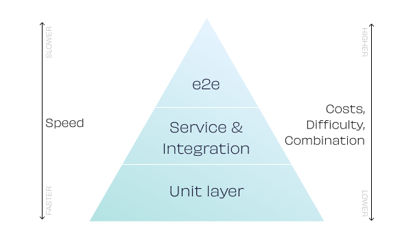
Some of the ideas behind the Automation pyramid align with these key attributes. The pyramid also indicates the track to find a root cause for a single feature error. One should start tracking root causes for errors from the lowest level of a pyramid and only then move upwards. We don’t recommend blindly following this model but it is potentially useful for considering if it’s a good match for your current project.

The pyramid is very specific to test automation and does not apply to your overall testing model.  For a much broader viewpoint in risk management the holistic approach  is recommended.

User facing end to end flows

The layer is the most complex layer to automate at, it has more dependencies, higher maintenance costs and a slower feedback loop than the lower levels. At this layer good development architecture practices are needed with automation, as are basic coding skills.

Mobile App automation can further complicate things compared to web apps, as there are less tools available and it’s often less testable. For example on a web application often it’s a straightforward case of directing a tool to a url, whereas on mobile apps you may need to consider things like emulators, debuggable builds, WebView’s outside of the application and native device configurations. It remains a very important opportunity for automation though particularly when it comes to the significant device variation risk. When it comes to the end to end layer and finding issues, hands-on risk based testing will often offer much more value.

Common automation models

Here are two example models we have leveraged from both where our own team is building the product and where our automation engineers step in to help out our customers teams.

Efficiency focused team model

This model really suits new products where close team collaboration is at the center of development. It’s designed to keep the automation code even at the end to end layer as close to the whole team and product code as possible.

The combination of high levels of collaboration, whole team contribution and building in parallel to product code make this a highly efficient approach to leveraging automation. 

It can be challenging initially for testers as some coding is required and we’ll often pair developers and testers together on automation to get the most out of this model. Our next article about Flutter automation will go into more detail on this approach.

Regression or complexity risk model. 

There are also many products/services out there which have run into regression issues and over time it has become detrimental to the team.  Automation can be used to primarily reveal the issues and to cover this risk.

It’s often worth optimising the efficiency of the Agile team model by utilising test automation so that it frees the developers from fighting regression risk fires on a daily basis.

In the hands of full time automation engineers the end to end coverage will often go broader and deeper. As it is distanced slightly from the developers and the code, there is the potential to utilise more tester friendly tools.

Once broad coverage of regression risk is in place it can be easier for the team to start addressing the root causes of the risk and consider a more optimal model going forward. 

Wrap up

We hope you have enjoyed reading some of our thoughts on automation and perhaps will take a few ideas that can promote active discussion before you jump in. It’s a great tool to add to your software development toolbox and help teams from many angles. We have a lot of experience in this area so get in touch for a chat and we can explore some options together. Or stay tuned for our next article that focuses on Flutter test automation. 

Contact Minna

Read more

All blogs
Back to the blog

How to transform design tokens from Figma to Flutter – in practice

Wondering about what design tokens are, or how they can be used in creating themes or multibranding? This article dives into the process and learning outcomes of a background study done for Rebel App Studio by Codemate’s team attending Fluttercon23 on the topic of “Unlock efficient multibranding with Flutter and Figma”. It explores the learning outcomes from the perspective of a multidisciplinary team comprising a designer, developer, and researcher. As the researcher, I will share my viewpoint on the work.

Wondering about what design tokens are, or how they can be used in creating themes or multibranding? This article dives into the process and learning outcomes of a background study done for Rebel App Studio by Codemate’s team attending Fluttercon23 on the topic of “Unlock efficient multibranding with Flutter and Figma”. It explores the learning outcomes from the perspective of a multidisciplinary team comprising a designer, developer, and researcher. As the researcher, I will share my viewpoint on the work.

During the research, I got to learn about the collaboration between designers and developers by being part of an experienced and supportive team of Timo Pieti and Petri Pystynen while getting ready for the Fluttercon23 event. The team focused on finding ways to create multibranding with Figma and Flutter. Not only was Flutter a rather new topic, but design tokens were something I had not stumbled across before.

The team I entered explained to me what they were trying to achieve and what design tokens are. The research goal was to find an automated, low-cost, and low-configuration requiring process for the transformation of design tokens from Figma to Flutter. To accomplish this, the research consisted of three phases, a background studytesting, and analysis. Let’s go through them in brief.

Study

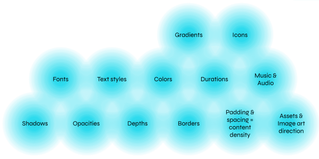
Getting ready for the Fluttercon23 event, the background study was the first thing on the agenda to gain understanding of design tokens. Design tokens are small repeated pieces of the design system that help the building of user interfaces creating consistency to the system (Chenais, 2018). Parameters that can be tokenized include colors, measurements, and fonts. A tokenized design system must be treated as the “single source of truth” to all design token solutions (Design Token Community Group). This helps the team by creating a synchroniced and up-to-date source for design tokens that everyone on the team can, and must, use. Design tokens also allow the creation of themes which can help with multibranding by easing the switching between different themes.

Tokenized design parameters.

Testing

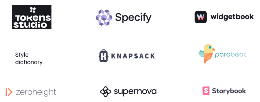
Testing the transformation of design tokens into Flutter code involved tools like Supernova.io, Tokens Studio, and Parabeac as well as many others. As design tokens are a rather new thing, many of the found design management tools didn’t support their usage, which resulted in only using Supernova and Tokens Studio in the final result.


Testing consisted of trying simple actions like creating the tokens, applying themes, or transforming created tokens into Flutter code. If any of those steps failed to meet the requirements of creating easy collaboration with developers and designers or needed too much manual work, the test ended in a failed attempt. All tests were analysed and learned from, to gain knowledge of the tokenized design system’s usage.

Tools that support the usage of design tokens.

Key findings

A new workflow was created: New workflows for creating feasibility in the designer and developer collaboration on the design handoff phase were found as the result of the research. This included creating the tokens in Figma with Tokens Studio and using Supernova for managing and exporting the tokens into code. Supernova was integrated straight to the Tokens Studio for Figma plugin which allowed tokens to be easily moved into Supernova. From Supernova to Flutter, the export was done with the Flutter-exporter provided by Supernova. Overall, this workflow included some manual work in the mapping stage, occurring when moving tokens to Supernova, and when exporting multiple themes into code.

Importance of identical naming: Important aspect in token creation is the need for identical naming when creating multiple themes. Token naming takes time but with proper usage the themes can be easily integrated and exported into code which will save time and workload in the end.

Communication can be eased up: Developers and designers are known for not properly discussing and sharing their knowledge between the roles. That should be left in the past and they should start properly communicating. Design hand-off can be a crucial part of the software development process and information should be effortlessly shared. With the created workflow, it is provided that all design solutions are stored in one place and can be accessed by everyone in the team.

The more in depth steps for the transformation can be found in the Fluttercon GitHub repository linked below. The result of the automated process was not fully achieved, though we found a good enough workaround, with our developed workflow. Therefore, the transformation of design tokens is a good topic for future studies as well.

Dive deeper

If you want to learn more about the design tokens and collaborative ways to work with them you can check out the following material, including the talk and included material given at Fluttercon23.

Unlock Efficient Multibranding with Figma and Flutter

Fluttercon demo Github

Read more

All blogs
Back to the blog

5 things to remember when developing and designing an accessible app

Accessibility issues impact all of us at different stages of our lives, whether they are permanent, temporary, or situational. Some individuals face lifelong challenges such as blindness or deafness, while others may experience temporary limitations due to injuries. Situational examples include being a new parent carrying a baby in one arm and trying to operate a phone with the other hand, struggling to see the screen after having dilated pupils from an eye appointment, or finding it more convenient to use speech input due to the environment or personal factors like accents. Considering that accessibility needs can affect anyone, it becomes crucial to prioritize accessibility in the design and development of apps and other digital solutions. This blog article aims to highlight five essential considerations when creating an accessible Flutter app. These insights were previously discussed in our online meetup held in March 2023

Accessibility issues impact all of us at different stages of our lives, whether they are permanent, temporary, or situational. Some individuals face lifelong challenges such as blindness or deafness, while others may experience temporary limitations due to injuries. Situational examples include being a new parent carrying a baby in one arm and trying to operate a phone with the other hand, struggling to see the screen after having dilated pupils from an eye appointment, or finding it more convenient to use speech input due to the environment or personal factors like accents. Considering that accessibility needs can affect anyone, it becomes crucial to prioritize accessibility in the design and development of apps and other digital solutions. This blog article aims to highlight five essential considerations when creating an accessible Flutter app. These insights were previously discussed in our online meetup held in March 2023

As this is a long read, you can jump also to the topics that interests you the most:

01 Readability
02 Color
03 Input
04 Animations
05 Screen readers

01 Readability

The first thing to consider when designing for accessibility is readability. Text size is a crucial factor here, and it’s essential to make sure that your app’s text is legible and adequately sized. Research has shown that up to 35% of iOS users do not use the standard text size, so it’s vital to make sure that your app can accommodate different font sizes.

To ensure that your app’s content is easy to read, you should separate the contents clearly from each other, use an adequate font size, legible font, and appropriate character spacing and line spacing.

Text Overflow

Text overflow is a common issue that can occur when working with Flutter. When dealing with Rows and Text, always use Expanded or Flexible to ensure that the text is wrapped nicely, even when the user changes the font size or when the backend returns longer text parameters. Otherwise, you’ll see black and yellow boxes near the border, indicating the text overflow issue.

Wrap Instead of Row

Another issue with Row is that it may not work correctly when you have a Row of items that are already wrapped into Expanded widgets. In such cases, the text might become unreadable when you rotate the device, apply a new localization, or increase the text size. The solution is to use Wrap instead of Row to make it responsive and easier to read.

maxLines and text cutting off

maxLines is another parameter that can affect your app’s accessibility. It determines the maximum number of lines that a text widget can display. However, if the text is too long and exceeds the maxLines parameter, the text may cut off, making it challenging to read.

To avoid this issue, use maxLines only when it makes sense to do so, such as when displaying a text preview. Otherwise, avoid using maxLines when showing actual content, as it may not be wise to set maxLines if it cuts off important information.

Contrast and Color Blindness

Color contrast is an essential aspect of accessibility. It is crucial to make sure that the text and background colors have enough contrast to ensure that users can read the content easily. Some users may have color blindness, making it difficult for them to distinguish between different colors.
To ensure that your app is accessible to users with color blindness, use colors that have sufficient contrast and are distinguishable. Additionally, consider using color schemes that work well for users with color blindness. Developers can use textContrastGuideline that Flutter provides to make sure text inputs have high enough contrast:

testWidgets('HomePage meets contrast guideline', (tester) async {
    // Enable semantics in this test
    final handle = tester.ensureSemantics();

    // Pump the widget
    await tester.pumpWidget(const MaterialApp(home: HomePage()));

    // Check that it meets the guideline
    await expectLater(tester, meetsGuideline(textContrastGuideline));
    handle.dispose();
});

02 Color

Color is an vital element in design, and getting it right is crucial, especially from a design point of view. Adequate contrast between text, informative elements, and the background is necessary for accessibility. However, color plays a significant role in all kinds of design. Color is indispensable for people with visual impairments or color blindness or those with low vision. Sometimes environmental factors, such as low brightness or reflections, can affect visual capacity.

Different types of color impairments exist, depending on which color the user cannot see. Some impairments are more common than others. Fortunately, Figma has a plugin that can validate different types of vision deficiencies with just a few clicks. It is vital to provide enough visual cues for CTAs and error messages. It is also helpful to use both an icon and a text, not just one or the other.

The focus states should also be emphasized, and using thick lines or an attention color can help. There has always been a debate about which is better: light mode or dark mode. Both have their benefits and downsides. It is possible to use both, and dark mode is particularly helpful for people with visual impairments. In fact, over 30% of the Netherlands uses dark mode, which is more than expected.

Inverted colors and high contrast mode are other modes that should be addressed. It is essential to make sure that contrast guidelines are being followed. Flutter has a test package that developers can use in their widget tests to ensure that guidelines are met. The package goes through the semantic tree, looking for nodes that correspond to a text or editable text widget, and calculates the contrast ratio from the most frequently occurring color according to a WCAG standard.

Overall, color is a crucial element in design, and it is important to ensure that it is used correctly. It is important to consider the needs of users with visual impairments and to provide enough visual cues for all users. By following guidelines and using tools such as Figma and Flutter, designers and developers can create accessible apps that meet the needs of all users.

03 Input

Input is a crucial aspect of any mobile application. It refers to how users interact with the app through various touch inputs, such as tapping and swiping. In this section, we will focus on the importance of tap areas in mobile app development, particularly in Flutter.

Tap areas are the clickable or touchable regions of the user interface, such as buttons or links. They are crucial for providing a smooth and seamless user experience. If the tappable area is too small, users may get frustrated and encounter errors while using the app. This is especially true for users with limited motor skills, for whom having big enough tap areas is critical.

Unfortunately, developers often overlook the importance of tap areas, either because they are not aware of the issue, or they think it is not a significant concern. As a result, tiny tap areas are a common problem in many mobile apps. This is often due to lack of consideration for accessibility or testing on real devices.

Flutter provides several tools to help developers create appropriate tap areas. For example, the Material Design guidelines recommend a minimum tap area size of 48 by 48 pixels. Flutter’s IconButton widget is an easy way to provide a decent tap area size for icons and also provides feedback, such as a ripple effect. Additionally, developers can use ConstrainedBox and SizedBox to create custom tap areas.

To ensure that clickable widgets meet the minimum size requirements, Flutter provides the androidTapTargetGuideline and iOSTapTargetGuideline, which check for tap areas of at least 48 by 48 and 44 by 44 pixels, respectively. Developers can also create their own guidelines to make sure their clickable widgets are at least a particular size. The accessibility_tools package can also be used to detect when a tap area is too small during UI building.

04 Animations

Animations can make a big impact on the user experience of an app, but some users may choose to disable or reduce the animations on their device. As developers, we need to be mindful of this and design our apps in a way that still makes them usable without relying solely on animations to convey important information.

One way to do this is to use other visual cues such as color, typography, and layout to draw attention to important elements in the app. Additionally, it’s important to not use animations just for the sake of drawing attention, but to have a clear purpose behind them that enhances the user experience.
From a technical standpoint, we can use the MediaQuery class in Flutter to check whether animations are currently enabled or disabled on the device, and adjust our app behavior accordingly:

final areAnimationsOn = MediaQuery.of(context).disableAnimations;

Developers can use a debug flag called debugSemanticsDisableAnimations to test app’s behavior when animations are disabled:

debugSemanticsDisableAnimations = true;

Overall, animations can be a powerful tool in designing engaging and intuitive user interfaces, but it’s important to consider the potential impact of animation settings on user experience and design our apps in a way that remains accessible and usable even with reduced animations.

05 Screen readers

Screen readers are those devices that help people with visual impairments to access all kinds of digital content. Designing for screen readers requires a lot of effort to make the application usable via keyboard. It is vital to ensure that the focus states are always visible and that the focus state visually follows the content order. Additionally, announcing errors clearly and offering some options, such as cancel, is essential. It is also crucial to make sure that things are in order and that users can navigate through using other forms other than just touching things.

A handy plugin for Figma called Focus Orderer allows designers to annotate designs with different focuses and tab orders. However, when making an app accessible to screen readers, the main thing to consider is ensuring that all elements have semantic information. A semantic label is some kind of descriptive text associated with an interactive widget in the Flutter app. This text provides information or context to the screen reader, which is used by a screen reader user to understand what the currently focused element is doing.

Sometimes you do not need to add a semantic label, as some widgets create semantic annotations under the hood, like text buttons, texts, and form fields:

// Semantic label in this case is "Button - Sign in"
TextButton(
    onPressed: () {},
    child: Text('Sign in'),
)

However, when you do need to add a semantic label, you can use the Semantics widget. For example, if you have an icon and decide to use a GestureDetector to make it clickable, you should think about adding a semantic label. There are several ways to do that, such as using the semanticLabel argument or the Semantics widget:

Semantics(
    label: 'Open Flutter website',
    child: GestureDetector(
        onTap: () {},
        child: FlutterLogo(),
    ),
)

Flutter automatically inserts lots of different semantics labels into your widget tree when you use built-in controls and widgets. However, when you are doing things like custom radio buttons and checkboxes, it is important to use properties on those as well as these labels. Providing people with clues that they are tappable is key.

Developers can use labeledTapTargetGuideline to make sure all tappable areas have semantic labels. Another option is to use accessibility_tools package in case you want to get such warnings while developing your UI.

Lastly, when building a form, you might think about using TextField’s decoration and providing a hint instead of using a Column with a title and a text field:

// This doesn’t give any context about text field to screen readers
Column(
    children: [
        Text('Email'),
        TextField(),
    ],
)

// This provides context what is expected by this text field
TextField(
    decoration: InputDecoration(
        hintText: 'Email',
    ),
)

This way, the text field is associated with the hint text, making it clearer for screen reader users. It is important to remember that making an app accessible to screen readers requires a lot of effort, but it is a critical step towards creating a more inclusive application.

To sum it up 

In conclusion, developing an accessible app is about ensuring that everyone, regardless of their abilities or disabilities, can use and enjoy your app. By keeping readability, color, input, animations and screen readers in mind when designing and developing your app, you can create an app that is accessible to everyone.

Want to dig deeper into the subject? Then check out our meetup recording on Youtube:

Read more

All blogs